http://www.vox.com/2015/5/11/8529217/40 ... sive-chart
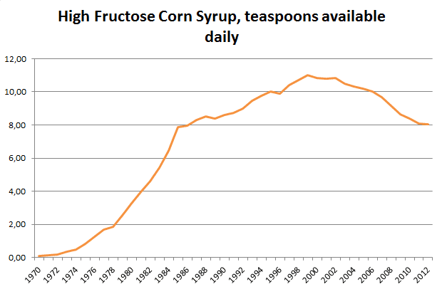
This chart tracks decreases/increases in foods since 1972. At the very bottom, you can see an almost 4000% increase in the consumption of HFCS. Think this would correlate nicely with the rise of obesity in America?
I'd like to take this data and compare it with obesity rates here, as well as compare it to the rise of HFCS in other countries with their obesity rates....
 It's funny you mentioned the 80's Peata because I've been thinking about that time period too lately. I just found out that my 59 year old uncle recently had a hip replacement and he partially blames the running/jogging phase he went through in the 80's (while on the Adkins diet). I remember my mom and so many other people's moms doing jazzercise, aerobics etc and trying to be like Jane Fonda who later admitted to having an eating disorder. I wonder how many people wrecked their metabolism doing excessive breathless exercise in the 80's and never recovered? :?