I'm not sure mortality rates is the best way to plot those. Disease incidence rates are probably what we should be looking at.
Graphic proof that vaccines work (with sources) – Isabella B. – Medium
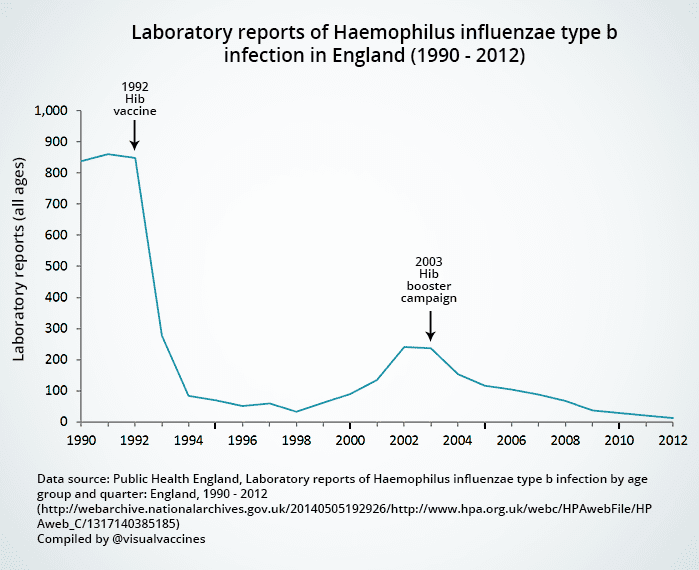
There are a bunch of UK graphs that show the same thing as the USA ones that I didn't include because of redundancy. They all tell a similar tale. How do you explain that?
Graphic proof that vaccines work (with sources) – Isabella B. – Medium
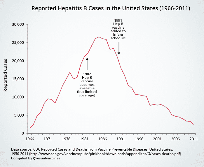
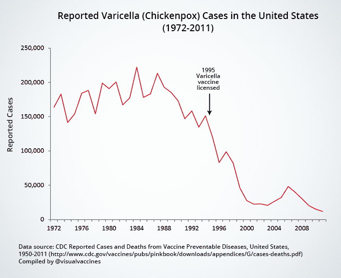
- Disease incidence is the correct metric. Since vaccines are designed to prevent the incidence of disease, rates of disease (morbidity) are the correct metric for evaluating vaccine effectiveness. If vaccines were a drug to treat disease, then case-fatality rates would be the correct metric for evaluation. Measuring vaccine effectiveness by looking at mortality rates only is a bit like measuring contraceptive effectiveness by measuring abortion rates only — it only tells a tiny part of the story.
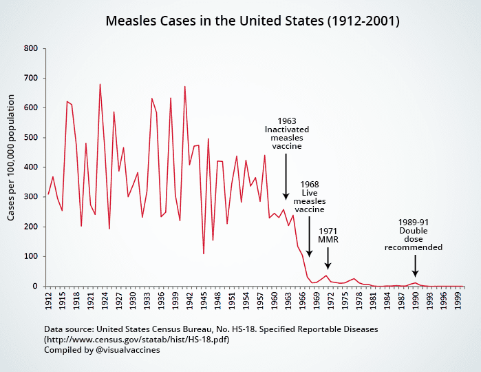
- Mortality rates do not reflect the true burden of the disease. Survivors of vaccine preventable disease can be maimed for life — think polio and paralysis, mumps and deafness, measles and mental disability, rubella and birth defects. Looking at mortality rates only misses the true burden of the disease. For example, before the introduction of the measles vaccine in the US in the 1960s, there were “only” 400–700 measles deaths a year. However, there were 4,000 cases of measles encephalitis a year (many of which led to neurological complications such as blindness, deafness and mental disability), 150,000 cases of respiratory complications, and 48,000 measles-related hospitalizations a year (which placed a huge financial and emotional burden on families) [1]. Together, these figures added to the motivation to eradicate the disease.
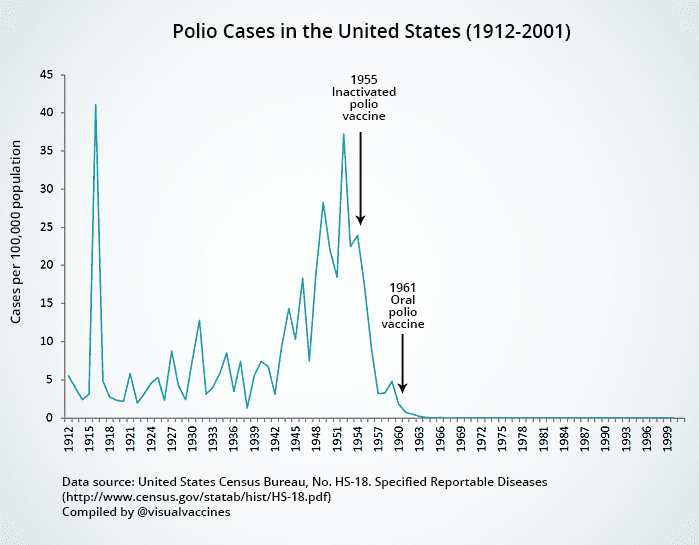
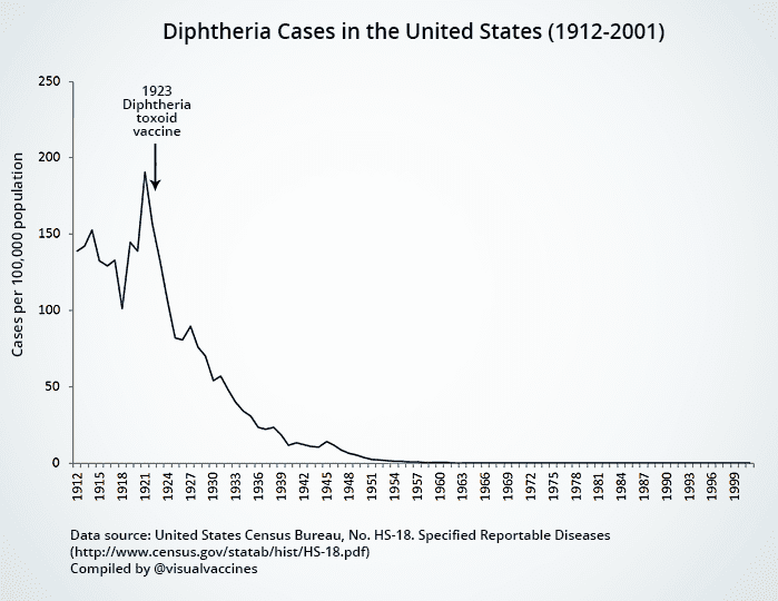
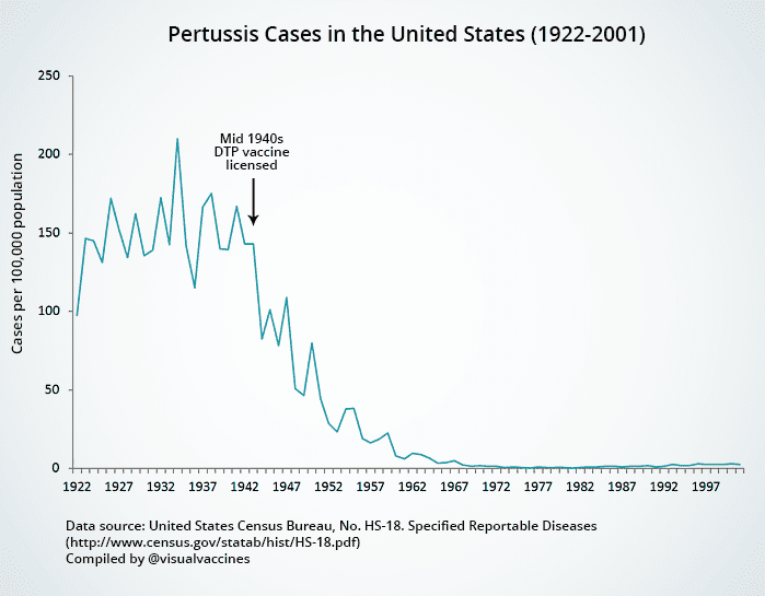
- Numerous factors affect mortality rates. Mortality rates are influenced by socioeconomic status, access to health care, quality of treatment and a wide range of other factors. As these factors change, mortality rates inevitably change. By contrast, as you can see from the graphs below, vaccine preventable disease incidence remained largely constant until the introduction of related vaccines. This may be because airborne diseases (like measles, mumps and rubella) can infect anyone, regardless of socioeconomic status.
- Mortality rates are not more accurate than morbidity rates. Those opposed to vaccination often use the “disease diagnoses are inaccurate” argument as a reason to look at mortality data only. However, the mechanism by which a doctor’s diagnosis suddenly becomes accurate when a patient dies, when he or she was not competent at diagnosing the disease in the first place, is not explained. In fact, death certificates will often be based on preceding diagnoses. Furthermore, as other researchers have noted, disease cases are more likely to be accurate as death certificates were only standardized from the 1960s onward [2].
There are a bunch of UK graphs that show the same thing as the USA ones that I didn't include because of redundancy. They all tell a similar tale. How do you explain that?